📓 1.1.4.8 Bootstrap Grid System
Lining up content evenly with only HTML and CSS can prove to be pretty challenging. That's why another most commonly-used Bootstrap feature is their grid system. The grid system allows us to use several Bootstrap classes to quickly create a wide variety of invisible grids that neatly space and line up content.
In this lesson, we'll explore how to implement this powerful feature in our own projects.
The Bootstrap grid system contains just two parts: rows and columns. It is built on a powerful CSS concept known as the flexbox. The flexbox is a very important layout model for web designers, so if you have a specific interest in design, we recommend exploring it further on your own.
The good news is that we can easily implement Bootstrap's grid system and take advantage of this functionality without knowing anything about flexbox at all. That's exactly what we'll do in this lesson.
Bootstrap Grid System
A bootstrap grid is a set of rows, each containing columns. There is no limit to the number of rows a page can have — but there can be no more than twelve columns. Let's add another file to our section-in-review project called bootstrap.html. This file isn't really meant to be part of our project — it's just an opportunity to practice with Bootstrap.
Next, add the following code:
<!DOCTYPE html>
<html lang="en-US">
<head>
  <title>Bootstrap Grid System</title>
  <link href="css/bootstrap.css" rel="stylesheet" type="text/css">
</head>
<body>
  <div class="container">
    <div class="row">
      <div class="col-6">
        <h1>Column 1</h1>
        <p>Some text here!</p>
      </div>
      <div class="col-6">
        <h1>Column 2</h1>
        <p>Some text here!</p>
      </div>
    </div>
  </div>
</body>
</html>
Let's take a look in the browser and then discuss what we're doing here.
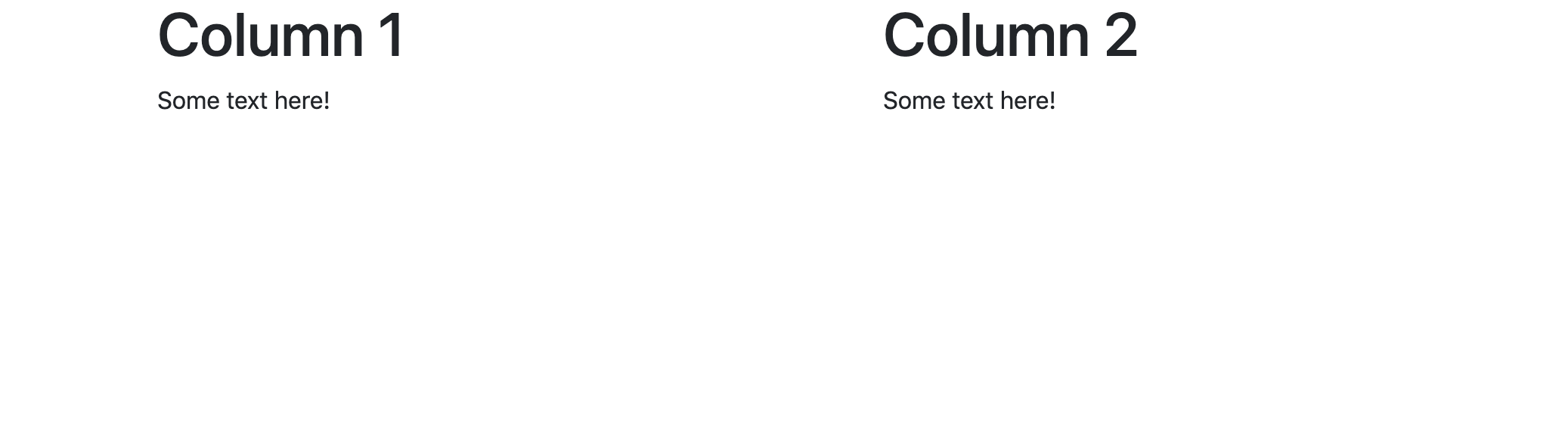
As we can see, we have two columns of equal width. Just as with other Bootstrap elements, they are responsive if we resize the page.
Now let's take a look at the Bootstrap format for creating these columns:
<div class="row">
  <div class="col-6">
    <!-- Column 1 -->
  </div>
  <div class="col-6">
    <!-- Column 2 -->
  </div>
</div>
Here, we have two columns nested in one row. The class of each column div is "col-6". Why 6, though? Well, remember that we can have up to twelve columns in a row. We can think of each of these columns as a single unit of width. So to make up half of the width of the page, we need six of those units. In order to have two columns then, each taking up half the width of the page, we need each of them to take up six units — that's why the class name is "col-6".
If we wanted to have three equal columns, we'd do the following:
<div class="row">
  <div class="col-4">
    <!-- Column 1 -->
  </div>
  <div class="col-4">
    <!-- Column 2 -->
  </div>
  <div class="col-4">
    <!-- Column 3 -->
  </div>
</div>
The difference here is that we use the class "col-4". This is because twelve divided by three is four — so our three columns are each four units wide.
We could use "col-3" if we wanted to have four columns of equal width and "col-2" if we wanted to have six columns of equal width.
Our columns don't have to be equal width, though. Bootstrap is very flexible and we could create a sidebar by doing something like this:
<div class="row">
  <div class="col-3">
    <!-- Column 1 only has a width of 3 units. -->
  </div>
  <div class="col-9">
    <!-- Column 2 has a width of 9 units. -->
  </div>
</div>
Try it out in the browser. Update the code in the container to have the code above as well as some headers and text. You'll see that the left column is 1/3 of the width of the right column. We could add more styling to the narrower column (such as a different colored background) to make it look more like a sidebar.
As long as the total value of units in a row is exactly equal to twelve, this system will work smoothly. Go over twelve and the columns will spill over into a new row (which will cause the page to become a mess). Go under and we will end up with odd white space.
Let's take a look at what happens when we have multiple rows. Replace all the content inside the "container" class with the following content:
<div class="row">
  <div class="col-6">
    <h1>Box 1</h1>
    <p>Some text here!</p>
  </div>
  <div class="col-6">
    <h1>Box 2</h1>
    <p>Some text here!</p>
  </div>
</div>
<div class="row">
  <div class="col-6">
    <h1>Box 3</h1>
    <p>Some text here!</p>
  </div>
  <div class="col-6">
    <h1>Box 4</h1>
    <p>Some text here!</p>
  </div>
</div>
Here's what this looks like in the browser:
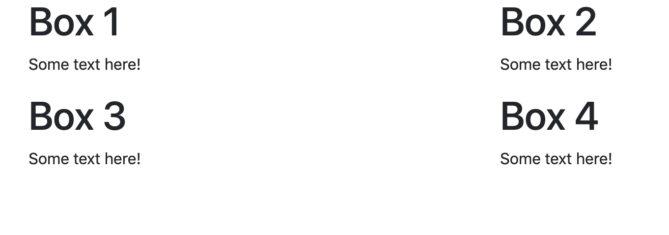
Unlike with columns, which have a certain width, rows do not have a specific preset height. Additional CSS and Bootstrap rules are necessary to alter the height of rows.
There are a few important things to remember when working with the Bootstrap grid system:
Rows must reside in a container. They don't necessarily need their own special container; if everything within the
<body>tags is housed in a container div, that will work just fine.Additionally, all columns must reside within a row. And each row may contain up to 12 column units. We'll discuss this in further detail in just a moment.
Column Class Name Format
We can actually make our columns even more specific by adding a media query. The format for doing so looks like this:
col-<media query>-<width>
If we were working with "col-6", we could update this to add a media query like this: "col-lg-6".
The media query portion of the column class name has several options:
xs: "Extra small" is used for phonessm: "Small" is used for tabletsmd: "Medium" is used for desktopslg: "Large" is used for large desktops
The xs, sm, md, and lg prefixes in column classes denote how narrow the viewport may become before the columns stack upon one another. In other words, Bootstrap has established an ideal breakpoint for when the columns should be. For example, here's the breakpoint for the sm media query:
This is really nice because we wouldn't want to have two tiny and difficult to read columns on a smaller device like a phone or a tablet.
The responsive breakpoints section of the Bootstrap Overview documentation gives more information on these media queries.
Updating Our First Section at Epicodus Site
Now that we have a little practice with the Bootstrap grid system, we can delete bootstrap.html. Let's update the index.html file of our project in section-in-review to incorporate a grid system.
We currently have 6 sections in our "First Section at Epicodus" website: Command Line, HTML, CSS, Bootstrap, and Partnering. Let's organize these into two rows of three columns, each with cards. Here's the updated code of <body>:
...
<body>
  <div class="container">
    <div class="jumbotron">
      <h1>My First Section at Epicodus</h1>
      <p>
        I've almost finished my first course section at Epicodus. Here are some of the things I've learned so far:
      </p>
    </div>
    <div class="row">
      <div class="col-md-4">
        <div class="card">
          <div class="card-body">
            <h2 class="card-title">Command Line</h2>
            <ul class="card-text">
              <li>Navigating my documents through the command line.</li>
              <li>Creating new files and folders through the command line.</li>
              <li>Moving and deleting files and folders through the command line.</li>
              <li>Retrieving my current location from the command line.</li>
            </ul>
          </div>
        </div>
      </div>
      <div class="col-md-4">
        <div class="card">
          <div class="card-body">
            <h2 class="card-title">Git and Github</h2>
            <ul class="card-text">
              <li>Initializing local Git repository, and create remote GitHub repositories.</li>
              <li>Tracking and committing changes with Git.</li>
              <li>Pushing a local Git repository to a remote GitHub repository.</li>
              <li>Branching a project to make multiple copies.</li>
              <li>Merging multiple Git branches back together.</li>
              <li>Cloning down a project from GitHub to my local machine.</li>
              <li class="bg-success">Publishing a website on GitHub pages.</li>
            </ul>
          </div>
        </div>
      </div>
      <div class="col-md-4">
        <div class="card">
          <div class="card-body">
            <h2 class="card-title">HTML</h2>
            <ul class="card-text">
              <li>Using HTML tags to create websites.</li>
              <li>Indenting and organizing HTML correctly.</li>
              <li>Incorporating block elements.</li>
              <li>Including inline elements.</li>
              <li>Using both spans and divs.</li>
              <li>Adding classes and ID's to style HTML with CSS.</li>
            </ul>
          </div>
        </div>
      </div>
    </div>
    <div class="row">
      <div class="col-md-4">
        <div class="card">
          <div class="card-body">
            <h2 class="card-title">CSS</h2>
            <ul class="card-text">
              <li>Creating a stylesheet.</li>
              <li>Using CSS selectors to specify an HTML element.</li>
              <li>Writing CSS rules to style particular elements in my HTML.</li>
              <li>Floating elements to create columns, sidebars, and other alignments.</li>
              <li>Padding, margins, and the box model.</li>
              <li>How CSS cascades to apply styles.</li>
            </ul>
          </div>
        </div>
      </div>
      <div class="col-md-4">
        <div class="card">
          <div class="card-body">
            <h2 class="card-title">Bootstrap</h2>
            <ul class="card-text">
              <li>Downloading and installing Bootstrap.</li>
              <li>Adding Bootstrap styles to a website.</li>
              <li>Navigating Bootstrap documentation.</li>
              <li class="bg-success">Creating websites with Bootstrap.</li>
            </ul>
          </div>
        </div>
      </div>
      <div class="col-md-4">
        <div class="card">
          <div class="card-body">
            <h2 class="card-title">Partnering</h2>
            <div class="card-text">
              <blockquote class="blockquote">
                <p>"It's been really good working with you!"</p>
                <footer class="blockquote-footer">My partner the first day</footer>
              </blockquote>
            </div>
          </div>
        </div>
      </div>
    </div>
  </div>
</body>
Each row contains three columns with a class of "col-md-4" and each of these columns contains a single card. We also have a lot more code in the body of our HTML. Good indentation is very important so we can make sure we don't have one div too many — or too few.
Try it out in the browser. We'll see two rows, each with three cards. Each card has equal width while the height of the row is determined by the tallest card. The height of the card itself is determined by the amount of text in it. It's nowhere near perfect but it's a good start.
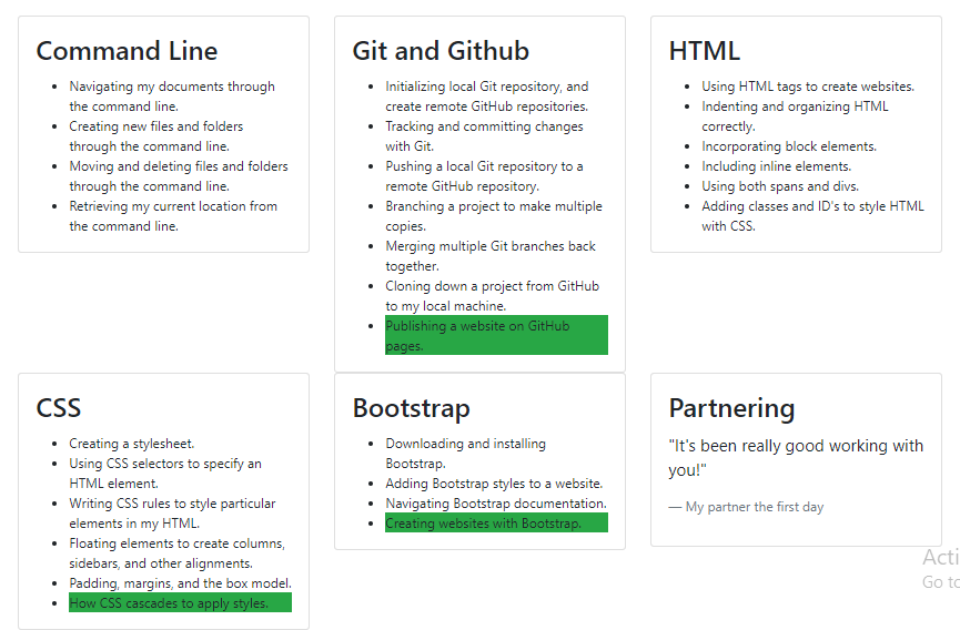
As you might've guessed, it's also responsive, with a breakpoint designed for medium-sized devices.