📓 1.1.3.7 Box Model
There's one last major piece of HTML and CSS we need to cover: the box model. Each element on a web page takes up space, and the box model describes the space around the element. Let's start with some unstyled HTML and then add CSS as we go to illustrate the box model:
<!DOCTYPE html>
<html lang="en-US">
<head>
  <link href="css/styles.css" rel="stylesheet" type="text/css" media="all">
  <title>Box model</title>
</head>
<body>
  <div class="my-class">Lorem ipsum dolor sit amet, consectetur adipisicing elit, sed do eiusmod tempor incididunt ut labore et dolore magna aliqua. Ut enim ad minim veniam, quis nostrud exercitation ullamco laboris nisi ut aliquip ex ea commodo consequat. Duis aute irure dolor in reprehenderit in voluptate velit esse cillum dolore eu fugiat nulla pariatur. Excepteur sint occaecat cupidatat non proident, sunt in culpa qui officia deserunt mollit anim id est laborum. Ut enim ad minim veniam, quis nostrud exercitation ullamco laboris nisi ut aliquip ex ea commodo consequat. Duis aute irure dolor in reprehenderit in voluptate velit esse cillum dolore eu fugiat nulla pariatur.</div>
</body>
</html>
Now, let's add a border around this text:
.my-class {
  border: 2px solid green;
}
Here's how to increase the space between the text in the <div> and the border around it:
.my-class {
  border: 2px solid green;
  padding: 4px;
}
Finally, we might want to make some room between the margin and the elements around it (which are, in this simple case, just the edges of the page):
.my-class {
  margin: 12px;
  border: 2px solid green;
  padding: 4px;
}
Now, let's apply a background color to this part of the page:
.my-class {
  margin: 12px;
  border: 2px solid green;
  padding: 4px;
  background-color: orange;
}
It just colors the content itself and the padding around it.
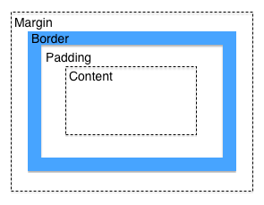
The box model is perhaps easiest to understand with a picture:

You'll run into the box model a lot when building web pages, so it's a good idea to get familiar with it.
The box-sizing Property
If we try to size a box with padding and margins, we'll run into a potential problem. Let's say we want a box that is 200px wide (200 pixels wide) with a 10px border and 10px of padding. You might think that the width of the box with border and padding will be 200px total, but that's not the case. The border and padding will be added to 200px — so the final box width will be 220px.
This issue also applies when the width property is set to a percentage as well, which we'll demonstrate here. Let's start with some new HTML:
<!DOCTYPE html>
<html lang="en-US">
<head>
  <link href="css/styles.css" rel="stylesheet" type="text/css" media="all">
  <title>Boxes</title>
</head>
<body>
  <div class="box1"><p>I'm box #1.</p></div>
  <div class="box2"><p>I'm box #2.</p></div>
  <div class="box3"><p>I'm box #3.</p></div>
</body>
</html>
As we can see, this HTML example has three boxes. Here are the styles:
.box1 {
  width: 50%;
  border: solid black;
  border-width: 1px;
  background-color: orange;
  margin-bottom: 10px;
}

.box2 {
  width: 50%;
  padding: 20px;
  border: solid black;
  border-width: 20px;
  background-color: orange;
  margin-bottom: 10px;
}

.box3 {
  width: 50%;
  padding: 50px;
  border: solid black;
  border-width: 30px;
  background-color: orange;
  margin-bottom: 10px;
}
As we can see, all of the boxes are set to a width of 50%. Each box has different padding and border-width properties.
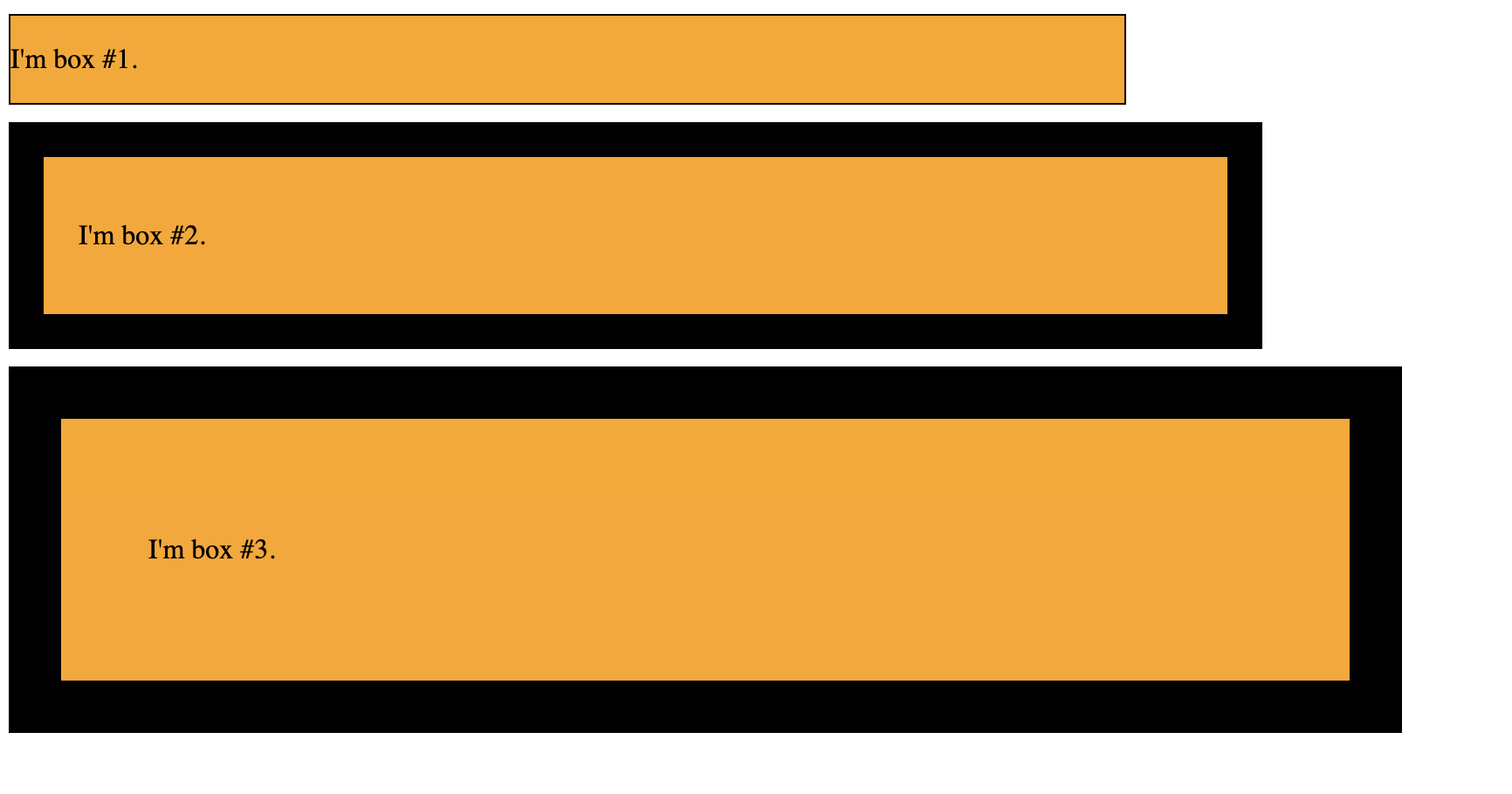
Here's how this HTML looks in the browser:

This is frustrating, especially when we are working with widths in percentages. They all have different widths — despite the fact that we specified that we want them all to be 50% of the width of the window. This is even more painful when the boxes are side by side — any border or padding can cause them to overlap with each other.
Fortunately, CSS now has a property called box-sizing which we can use to address this issue. The following property is the default behavior of CSS:
box-sizing: content-box;
This is what we are already doing, though, so generally it's not very useful to add this property.
Alternatively, and much more usefully, we can use the border-box property:
box-sizing: border-box;
This property will include the padding and border width in the width we specify. Let's update each of our boxes to have this property:
.box1 {
  width: 50%;
  border: solid black;
  border-width: 1px;
  background-color: orange;
  margin-bottom: 10px;
  box-sizing: border-box;
}

.box2 {
  width: 50%;
  padding: 20px;
  border: solid black;
  border-width: 20px;
  background-color: orange;
  margin-bottom: 10px;
  box-sizing: border-box;
}

.box3 {
  width: 50%;
  padding: 50px;
  border: solid black;
  border-width: 30px;
  background-color: orange;
  margin-bottom: 10px;
  box-sizing: border-box;
}
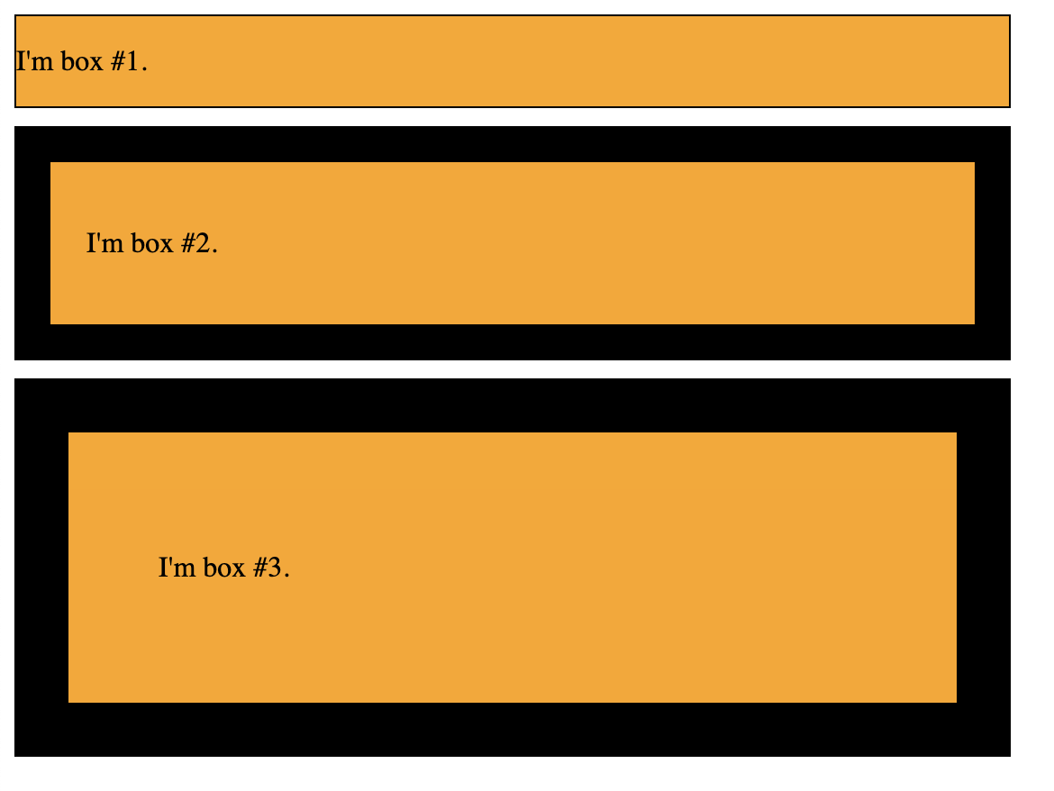
Now if we take a look, we'll see that all the boxes are the same width:

Note, however, that this only affects width, not height.
In general, when we want to add padding or borders to a box, we recommend using the border-box property to simplify sizing.