📓 1.1.3.9 Centering Elements and Images
It's common to want to center elements on a page — and as we've already learned, it's easy to do so with text. All we have to do is add the following property:
text-align: center;
However, it's a little bit trickier to center boxes and images.
Fortunately, it isn't too hard — as long as we understand a few important gotchas about CSS, which we'll cover in the following example. You won't be expected to center elements on the upcoming independent project. However, it's common for students to want to center elements in their projects and it can be frustrating when it's not working correctly.
Let's start with some HTML. We'll use the box model HTML code again with some changes added for spans and images:
<!DOCTYPE html>
<html lang="en-US">
<head>
  <link href="css/styles.css" rel="stylesheet" type="text/css" media="all">
  <title>Box model</title>
</head>
<body>
  <img src="cat.jpeg" class="centered-image">
  <span class="my-class">Hi there!</span>
  <div class="my-class">Lorem ipsum dolor sit amet, consectetur adipisicing elit, sed do eiusmod tempor incididunt ut labore et dolore magna aliqua. Ut enim ad minim veniam, quis nostrud exercitation ullamco laboris nisi ut aliquip ex ea commodo consequat. Duis aute irure dolor in reprehenderit in voluptate velit esse cillum dolore eu fugiat nulla pariatur. Excepteur sint occaecat cupidatat non proident, sunt in culpa qui officia deserunt mollit anim id est laborum. Ut enim ad minim veniam, quis nostrud exercitation ullamco laboris nisi ut aliquip ex ea commodo consequat. Duis aute irure dolor in reprehenderit in voluptate velit esse cillum dolore eu fugiat nulla pariatur.</div>
</body>
</html>
We have an image with a class of centered-image as well as a span and a div, both which have the class my-class. If you want to follow along, you'll have to add an image, whether it's a cat or something else. Don't forget that you'll need to update the image name in the HTML code to match the name of the file you use.
Here's the CSS so far:
.my-class {
  border: 2px solid green;
  padding: 10px;
  background-color: orange;
  margin-top: 20px;
  margin-bottom: 20px;
  box-sizing: border-box;
}

.centered-image {
  width: 50%;
  height: auto;
}
.my-class uses the box model we learned about in the last lesson. .centered-image makes our image responsive, which means it will respond to the size of the browser window. This design approach is called responsive web design, which focuses on styling a webpage so that it looks good on all screen sizes. In this case, we are simply stating that the width of the image should be 50% of the browser and the height should automatically scale with it. Whenever we want an image to resize based on the browser window, we need to add a width that is a percentage.
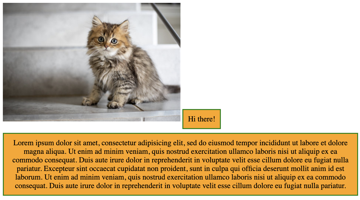
Now let's take a look at how this looks in the browser:

Other than the kitten, this site isn't looking very visually appealing. The kitten image and the first box are side by side because they are inline elements. Spans are always inline elements and images are inline by default as well.
Meanwhile, the box on the bottom is a block element. That means it starts on a new line.
We learned about inline and block elements earlier in this section. We're bringing up the distinction again now because it's very important for centering elements. Let's demonstrate.
Here's the most common way to center an element that's not text:
margin: auto;
width: [SET-WIDTH-HERE]
margin: auto; is not very intuitive or easy to remember, but this property horizontally centers an element. However, it only works if a width is specified. This width can be a percentage or a fixed pixel width.
Let's add this rule to both of our classes:
.my-class {
  border: 2px solid green;
  padding: 10px;
  background-color: orange;
  margin: auto;
  margin-top: 20px;
  margin-bottom: 20px;
  width: 50%;
  box-sizing: border-box;
}

.centered-image {
  margin: auto;
  width: 50%;
  height: auto;
}
We've added margin: auto; to both rules and width: 50% to .my-class. By the way, note that the margin: auto; rule is above the other margin rules. This is because margin: auto; sets the top and bottom margins as well. To override those default settings, we have to put margin-top and margin-bottom below it. All properties are applied from top to bottom. It's kind of like if we painted a house green and then painted it red. The second rule overrides the first and the house ends up being red, not green.
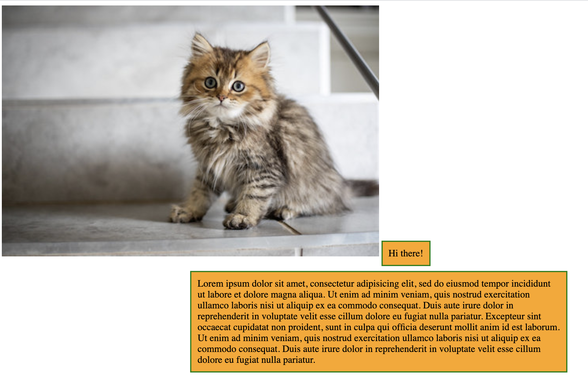
Let's take a look at our page now:

As we can see here, our rule is working correctly for the bottom box but not for the image or the top box.
This is because both the image and the span are inline elements. We can not apply this margin rule to an inline element. To fix this issue, we need to tell our page that we want the element to be a block element, not the default inline element. To do that, we can add:
display: block;
Let's add that to both rules now:
.my-class {
  border: 2px solid green;
  padding: 10px;
  background-color: orange;
  display: block;
  margin: auto;
  margin-top: 20px;
  margin-bottom: 20px;
  width: 50%;
  box-sizing: border-box;
}

.centered-image {
  margin: auto;
  width: 50%;
  height: auto;
  display: block;
}
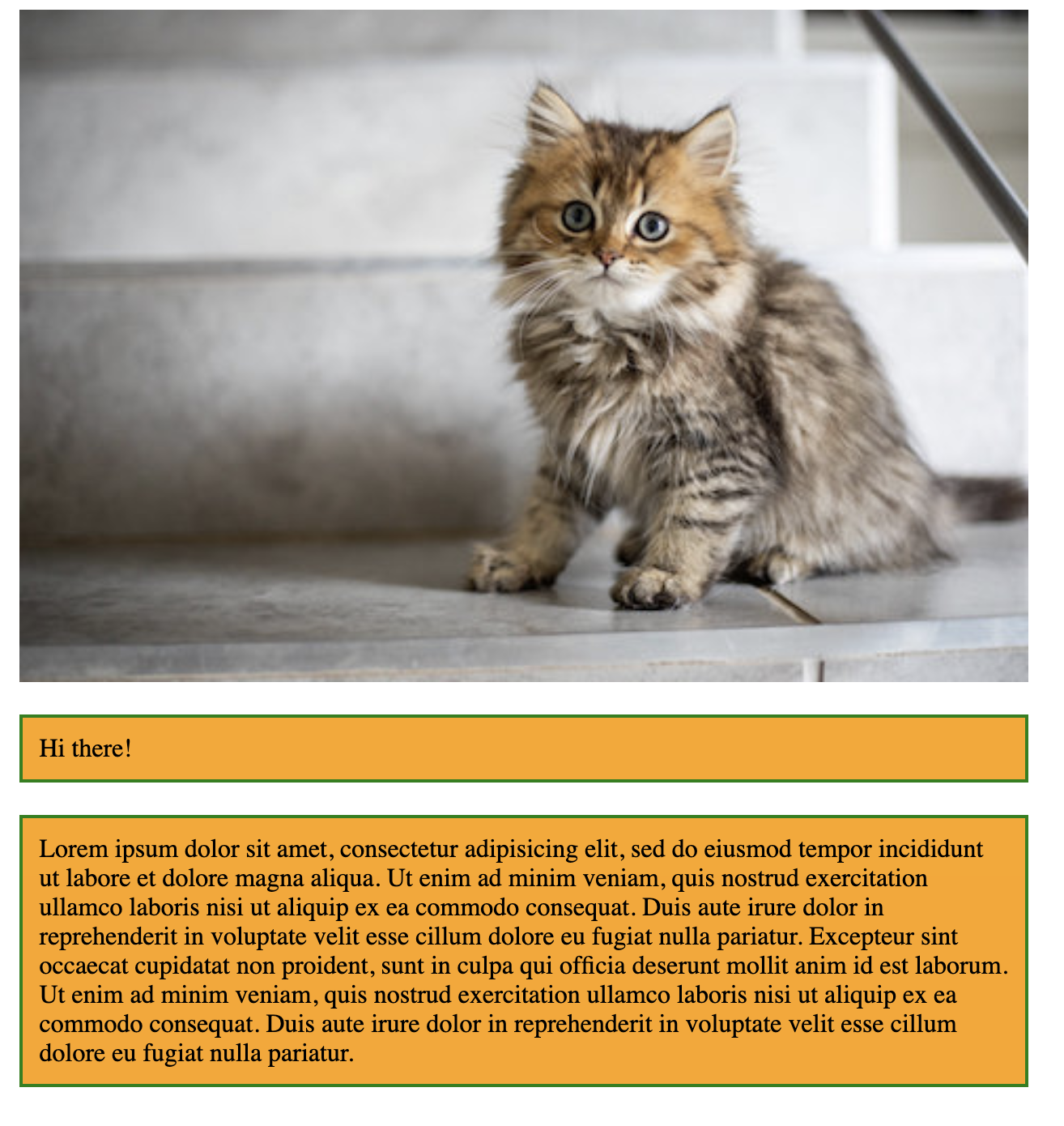
Now if we refresh our page, everything will be correctly centered. Note that none of the elements are inline anymore — they all start on new lines because they are now block elements.
