📓 1.1.4.6 Bootstrap Basic Elements
In this lesson, we'll learn how to implement several of the most common Bootstrap resources and styles. These resources will make our projects look considerably nicer without much additional work.
Project Setup
We'll create a website to summarize what we've learned so far this in this section — and we'll add Bootstrap styles along the way.
Start by creating a new project directory called section-in-review. It will contain an .html file named index.html and a css directory.
Now let's add some starter code to index.html:
<!DOCTYPE html>
<html lang="en-US">
<head>
  <title>My First Section at Epicodus</title>
</head>
<body>
  <h1>My First Section at Epicodus</h1>
  <p>
    I've almost finished my first course section at Epicodus. Here are some of the things I've learned so far:
  </p>
  <h2>Command Line</h2>
  <ul>
    <li>Navigating my documents through the command line.</li>
    <li>Creating new files and folders through the command line.</li>
    <li>Moving and deleting files and folders through the command line.</li>
    <li>Retrieving my current location from the command line.</li>
  </ul>
  <h2>Git and GitHub</h2>
  <ul>
    <li>Initializing local Git repository, and create remote GitHub repositories.</li>
    <li>Tracking and committing changes with Git.</li>
    <li>Pushing a local Git repository to a remote GitHub repository.</li>
    <li>Branching a project to make multiple copies.</li>
    <li>Merging multiple Git branches back together.</li>
    <li>Cloning down a project from GitHub to my local machine.</li>
    <li>Publishing a website on GitHub pages.</li>
  </ul>
  <h2>HTML</h2>
  <ul>
    <li>Using HTML tags to create websites.</li>
    <li>Indenting and organizing HTML correctly.</li>
    <li>Incorporating block elements.</li>
    <li>Including inline elements.</li>
    <li>Using both spans and divs.</li>
    <li>Adding classes and ID's to style HTML with CSS.</li>
  </ul>
  <h2>CSS</h2>
  <ul>
    <li>Creating a stylesheet.</li>
    <li>Using CSS selectors to specify an HTML element.</li>
    <li>Writing CSS rules to style particular elements in my HTML.</li>
    <li>Floating elements to create columns, sidebars, and other alignments.</li>
    <li>Padding, margins, and the box model.</li>
    <li>How CSS cascades to apply styles.</li>
  </ul>
  <h2>Bootstrap</h2>
  <ul>
    <li>Downloading and installing Bootstrap.</li>
    <li>Adding Bootstrap styles to a website.</li>
    <li>Navigating Bootstrap documentation.</li>
    <li>Creating websites with Bootstrap.</li>
  </ul>
</body>
</html>
Let's take a look at our site:
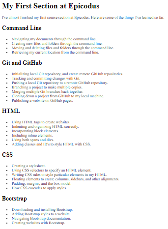
Not very exciting so far. It's time to add Bootstrap!
Adding Bootstrap
As described in the Bootstrap: Downloading & Installing lesson, let's download a copy of Bootstrap and place the bootstrap.css stylesheet into our project's css folder.
Note: We are taking this approach instead of a CDN because it can be useful to take a look at the bootstrap.css file for development purposes. That's also why we aren't using the minified version.
Our project directory should be organized like this:
section-in-review
├── css
│   └── bootstrap.css
└── index.html
Then, we'll link this Bootstrap stylesheet in the <head> tags of our HTML file:
...
<head>
  <title>My First Section at Epicodus</title>
  <link href="css/bootstrap.css" rel="stylesheet" type="text/css">
</head>
...
(Note: Remember, when ... is in a code snippet, this simply means that we've omitted code from the file we're depicting, in order to make it clearer to see where changes have occurred.)
Bootstrap Styles
If we refresh our page, we'll see it already looks different:
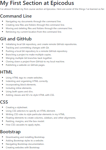
It looks a little better, but we've hardly scratched the surface of what we can do. Bootstrap provides many styling rules we can apply to our HTML. Let's add one now.
Containers
One of the most commonly-used Bootstrap elements is a container. Containers wrap our content and add padding that dynamically increases or decreases in size depending on the user's viewport.
We can add a container to our HTML like this:
<!DOCTYPE html>
<html lang="en-US">
<head>
  <title>My First Section at Epicodus</title>
  <link href="css/bootstrap.css" rel="stylesheet" type="text/css">
</head>
<body>
  <div class="container">

    ...

  </div>
</body>
</html>
Here we've placed a div directly inside our <body> tags with a class of container. (Note that ... is a placeholder for all our body HTML — don't remove the HTML from your own project.)
If we refresh the page, we'll see that padding has been added around the edges of our content:
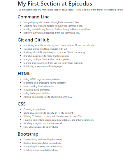
Also, if we resize the width of the browser window, we can see that the amount of padding automatically changes depending on the size of the viewport. When we integrate Bootstrap elements and components into our pages, they're automatically responsive.
Bootstrap is essentially a really big CSS stylesheet. Earlier, we learned how to add classes to HTML elements to style our pages. Adding Bootstrap's built-in container class is very similar. But instead of manually defining CSS rules that style anything with the container class in our own stylesheet, the Bootstrap stylesheet we included in our project already has CSS rules for the container class defined. All we need to do is add this class in order to make use of the CSS in the bootstrap.css file!
Jumbotron
Another commonly-used Bootstrap element is something called a Jumbotron. Jumbotrons are primarily used to add emphasis to content on a page. They'll often be placed at the top of the page to act as a heading.
Just like the container, we can add a Jumbotron by including a div with the jumbotron class wherever we'd like it to appear. Let's place ours at the top of the page, directly within our container:
...

  <body>
    <div class="container">
      <div class="jumbotron">
        <h1>My First Section at Epicodus</h1>
        <p>
          I've almost finished my first course section at Epicodus. Here are some of the things I've learned so far:
        </p>
      </div>

...
We can refresh the page and see our new Jumbotron:
Once again, this element is automatically responsive. Our jumbotron will re-center itself and its text as the width of the viewport changes.
Typography
Blockquotes
Bootstrap also includes many easy ways to style text. For instance, we can add blockquotes to display nicely-formatted quotes on our page.
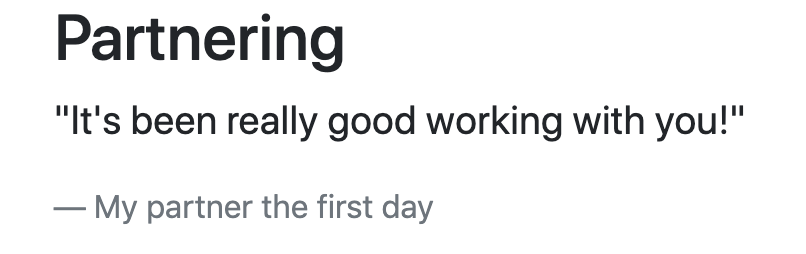
Let's add another section to our site. We'll call it "Partnering" and it will contain a quote from one of our partners this section:
...

      <h2>Bootstrap</h2>
      <ul>
        <li>Downloading and installing Bootstrap.</li>
        <li>Adding Bootstrap styles to a website.</li>
        <li>Navigating Bootstrap documentation.</li>
        <li>Creating websites with Bootstrap.</li>
      </ul>
      <h2>Partnering</h2>
      <blockquote class="blockquote">
        <p>"It's been really good working with you!"</p>
        <footer class="blockquote-footer">My partner the first day</footer>
      </blockquote>
    </div>
  </body>
</html>
To do this, we need to add a blockquote with a class of "blockquote". Inside that class, we can specify a footer with a class of "blockquote-footer" for the attribution of the quote. Check it out:
Built-in Classes
Another great feature of Bootstrap is the wide variety of built-in classes we can add to almost any element.
Let's highlight a few concepts we found enjoyable during this course section in green. We can do this by adding the bg-success class to various <li> tags on our page.
bg stands for "background", and success is a name used throughout Bootstrap to refer to a particular shade of green:
...

      <h2>Git and GitHub</h2>
      <ul>

         ...

        <li class="bg-success">Publishing a website on GitHub pages.</li>

         ...

      </ul>
      <h2>CSS</h2>
      <ul>

        ...

        <li class="bg-success">How CSS cascades to apply styles.</li>
      </ul>
      <h2>Bootstrap</h2>
      <ul>

        ...

        <li class="bg-success">Creating websites with Bootstrap.</li>
...
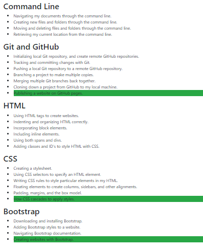
Similarly, we could use the bg-info class on our existing blockquote to add some color. Try it out on some of the <li>s in the project.
Cards
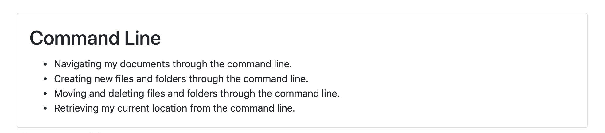
Another simple effect that can easily organize a page is a card. It allows us to organize content inside a card. Let's update our HTML and then take a look.
...
    <div class="card">
      <div class="card-body">
        <h2 class="card-title">Command Line</h2>
        <ul class="card-text">
          <li>Navigating my documents through the command line.</li>
          <li>Creating new files and folders through the command line.</li>
          <li>Moving and deleting files and folders through the command line.</li>
          <li>Retrieving my current location from the command line.</li>
        </ul>
      </div>
    </div>
...
Our card has a class of "card" and then we have various classes inside the card depending on the element: "card-body" for the body of the card, "card-title" for the title, and "card-text" for the text. Here's what it looks like:
This is a very basic card and we can do a lot more with it — for instance, there's an option to add images that fit inside the card as well. Just check out the documentation.
Cards are also automatically responsive and will resize automatically as the user's viewport changes in size.
While our site still looks relatively plain, we can do a lot more with Bootstrap. With just a few additional HTML tags, we can quickly transform the style and format of our pages. Make sure to check out the components documentation to see some of the things we can do with Bootstrap.
In the next few lessons, we'll explore additional Bootstrap elements, how to integrate our own CSS stylesheets with Bootstrap styles, and more.
As we move forward in the course, take advantage of Bootstrap to make professional, polished pages for all your projects. You aren't expected to be an expert on styling — but the nice thing about Bootstrap is that you don't have to be.