📓 1.2.4.2 Form Input Types
We've already seen how to gather input from text fields, but there are a variety of other types of form fields as well: select boxes, radio buttons, and checkboxes are perhaps the most prominent.
HTML5, finalized in 2014 and now widely supported, also introduced a number of additional values for the type attribute on inputs, including date, color, email, tel, url, number, and many others. See the MDN documentation on the HTML <input> element for a full list of HTML input types.
Bootstrap also has more information about form input types on their documentation. We always recommend trying out Bootstrap in your projects periodically, if not regularly, because it has easy-to-implement, pre-built styles that makes a webpage look polished and modern.
Generally as you come across the need to gather input in a particular way, you should do some research to figure out how to read input in that way. We'll introduce a few of the most common input field types. But first, a note of warning: always parseInt() number values that are retrieved from forms.
Just because you mark your HTML input field as number, date, or tel, don't expect it to come in as the JavaScript number type. Marking it in your html as type="number" just means that the browser will do some preliminary checking to encourage the user to enter a number rather than some text. But when you use document.querySelector("input").value to read the input, it will still come in as a JavaScript string, not a number. The HTML input types mostly just help indicate to the user what type of input is expected and/or allow the user to more easily enter a value such as a date or color.
Select Boxes
Select boxes are form inputs where the user can only select one item. These are often called "dropdown menus".

This goes inside the form in your html:
<form id="select-form">
  <select id="beverage">
    <option>Coffee</option>
    <option>Tea</option>
    <option>Kombucha</option>
    <option>Water</option>
  </select>
  <button type="submit">Submit Selection</button>
</form>
And this is one way to read out the value in your form submit event handler:
function handleSelect(event) {
  event.preventDefault();
  const selection = document.getElementById("beverage").value;
}

window.addEventListener("load", function() {
  document.getElementById("select-form").addEventListener("submit", handleSelect);
});
If you wanted to instead give each option a value different from the text the user sees, you could set a value attribute on each <option> element to define each value, something like this:
<form id="select-form">
  <select id="beverage">
    <option value="1">Coffee</option>
    <option value="2">Tea</option>
    <option value="3">Kombucha</option>
    <option value="4">Water</option>
  </select>
  <button type="submit">Submit Selection</button>
</form>
Now when you gather the input with document.getElementById("beverage").value you'll get "1", "2", "3" or "4". Note that they still come in as strings, so in this case you would probably want to use parseInt() to convert the inputted data to a number.
Check out the MDN reference page for the <select> element for more information. You'll find a handy built-in console that lets you test out this element, as well as information on other attributes we can use with the <select> and <option> elements.
Radio Buttons
Radio buttons allow the user to select one and only one option from a list.

Here's an example of doing radio buttons:
<form id="radio-form">
  <label>
    <input type="radio" name="flavor" value="chocolate" checked>
    Chocolate
  </label><br />
  <label>
    <input type="radio" name="flavor" value="vanilla">
    Vanilla
  </label><br />
  <label>
    <input type="radio" name="flavor" value="cookies and cream">
    Cookies & Cream
  </label><br />
  <button type="submit">Submit Selection</button>
</form>
In this code snippet, we've set the type attribute of our inputs to radio. For formatting, we've added <br /> tags after each label in order to stack the form options vertically.
Including the same name attribute and value on every radio button input is crucial to the function of this form type. The name attribute groups all of the radio buttons together in order to ensure that only one radio button is selected at a time.
We've also added a new attribute checked to the first radio button input: <input type="radio" name="flavor" value="chocolate" checked>. This means that this radio button is selected by default. The checked attribute is optional, but it's always a good idea to have a default value selected. Otherwise, a user may forget to choose one of the options, resulting in an undefined value when a form is submitted.
Notice how each <input> is nested inside of a label elements. This enables the label as well as the radio button itself to be clicked in order to make a selection. We could also enable this feature using a for attribute on the <label> and a matching id attribute on the <input>, like in the code snippet below.
<form id="radio-form">
  <input type="radio" name="flavor" value="chocolate" id="choc" checked>
  <label for="choc">Chocolate</label><br />
  <input type="radio" name="flavor" value="vanilla" id="van">
  <label for="van">Vanilla</label><br />
  <input type="radio" name="flavor" value="cookies and cream" id="cookies">
  <label for="cookies">Cookies & Cream </label><br />
  <button type="submit">Submit Selection</button>
</form>
Take note that our code will still work if we don't use either formatting (nesting inputs in the label or using the for and id attributes), but this will make it so that only the radio button itself can be clicked to make a selection.
And a way to read the value selected:
function handleRadio(event) {
  event.preventDefault();
  const radioSelection = document.querySelector("input[name='flavor']:checked").value;
}

window.addEventListener("load", function() {
  document.getElementById("radio-form").addEventListener("submit", handleRadio);
});
"input[name='flavor']:checked" is a newer more complicated query selector. Let's break this down:
inputtargets any inputs in the DOM.[name='flavor']tells the querySelector method to look only at elements with anameattribute set to'flavor'. This ensures that we're looking at all of our radio button inputs, which all share the samenameattribute and value.:checkedmakes sure that we grab the value of only the radio input that is selected.
Check out the MDN reference page for the <input type="radio"> element for more information. You'll find a handy built-in console that lets you test out this element, as well as information on other attributes we can use with the radio inputs.
Checkboxes
Checkboxes work similarly to radio buttons, but allow users to select multiple options. Because we want to be able to collect all of a user's selections, we will first need to learn about something called an array, which we will do in the next course section. In its simplest form, an array is simply a list of multiple items packaged together.
Button Types — A Review
The type attribute that we set for a <button> element will change how we can use it in our HTML.
<button type="submit">Submit Form</button>
A button with a type attribute set to "submit" is meant to be used in form elements, and it causes a submission event on a form. The default reaction to a submission event is to refresh the page.
<button type="button">Show More Information</button>
A button with a type attribute set to "button" makes the button element have no default behavior and do nothing when pressed by default. If we are targeting a submit event with an event listener and we use include type="button" on our form's button, our code will break. This is because we can target a click event on a button with type="button", but not a submit event, so we cannot use type="button" for a button element within an HTML form. Using type="button" on a button element is great for showing/hiding elements, or changing styles.
<button>Click Me</button>
What about a <button> element with no type attribute specified? This comes down to context. When unspecified, the default type attribute value for buttons is type="submit". So, if the button is used in a form without a type attribute, we can still target and respond to a submission event. If a button is used outside of a form, we can also target and respond to a click event.
So why bother specifying a button's type attribute? It makes the functionality of our code easier to understand at a glance. It also introduces finer control when we are specific about the purpose of a <button> element. Finally, properly using HTML elements helps screen readers navigate our websites. This is a topic that's a part of the larger topic of web accessibility. There's more to learn than we have the time to cover in the program. In fact, some developers focus their entire careers on accessibility. If you want to learn more, visit the article "HTML: A good basis for accessibility" on MDN.
More HTML5 Input Types
Date
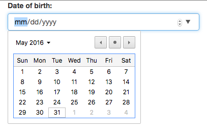
The date input type provides an easier interface for users to browse, select, and input dates:

<label for="born">Date of birth:</label>
<input id="born" type="date">
const dob = document.getElementById("born").value;
Color
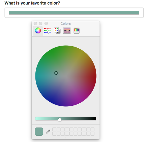
You may not have seen this one before! The color form input type, when clicked, opens a special panel where users can fine-tune and select specific colors:

<label for="color">What is your favorite color?</label>
<input id="color" type="color">
const favoriteColor = document.getElementById("color").value;
More to Explore
There's more that we haven't covered in this lesson. Check out these resources about other HTML5 input types and how to style them with Bootstrap:
- MDN Reference Page on the HTML
<input>element - An Article on Using HTML5 Input Types
- Bootstrap's Styling Documentation for Forms
And don't forget to always parseInt() number values that are retrieved from forms!