📓 4.5.0.8 Help Queue: Planning and Setup for Context
In this lesson, we'll use React context in our Help Queue application to add a button that toggles between a light and dark theme. We'll need to do a few things to create this new functionality:
- Add a new button component that will toggle between styles.
- Determine which HTML elements need styling to create the light and dark theme.
- Create a set of styles.
- Determine where state should live in our application.
- Implement context and a state management tool to complete the toggle functionality.
We're going to complete all of the above in this lesson, except for the last bullet point. As such, we'll be focused on project setup and planning. Then, in the next two lessons we'll implement context.
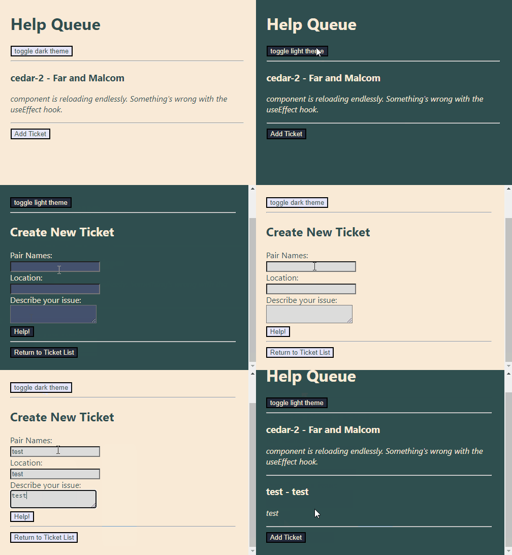
By the end of this walkthrough the Help Queue app will look like this:

Project Setup and Planning
We've already created a few versions of our Help Queue, so which one do we want to update? We'll stick to our original Help Queue project that we created in the React Fundamentals course section. If you have your own copy that you created, you are welcome to use it. Otherwise, go ahead and clone down and use this starter project:
GitHub Repo for Help Queue Starter Project
Take note that this means we're reverting back to using TicketControl.js as a class component — but this is good for us! We'll be able to learn how to use context in a class component.
Adding a ToggleTheme Component
The first thing we'll do is add a new component that has a button in it that toggles our light and dark theme. We'll call our new component ToggleTheme.js.
import React from "react";

function ToggleTheme() {
  return (
    <React.Fragment>
      <button>Toggle Theme</button>
      <hr/>
    </React.Fragment>
  );
}

export default ToggleTheme;
There's not much going on in this component now. Just the basics of what we want our UI to look like. Later on, we'll add state to make the toggling functionality work.
Next, let's update App.js to import and render the new ToggleTheme component:
import React from "react";
import Header from "./Header";
import TicketControl from "./TicketControl";
import ToggleTheme from "./ToggleTheme";

function App(){
  return (
    <React.Fragment>
      <Header />
      <ToggleTheme />
      <TicketControl />
    </React.Fragment>
  );
}

export default App;
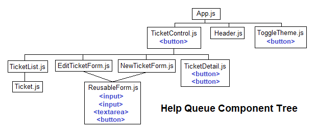
After this update, this is what our Help Queue component tree should now look like:
Determining Which Elements Need Styling
If we want to create a light/dark theme, we'll need to update the color of the text and the background color. Doing that will be as simple as changing the CSS on our HTML's <body> tags to target all of its descendants. However, doing so will not change the color of buttons or form inputs, so we'll have to target those elements individually.
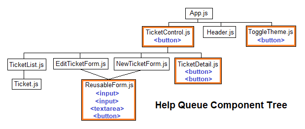
So, the first question we need to answer is where our buttons and inputs are! It turns out we have buttons and inputs in four components. We can visualize their locations in our component tree:

TicketControl.js: one<button>element.ToggleTheme.js: one<button>element.TicketDetail.js: two<button>elements.ReusableForm.js: one<button>element, two<input>elements, and one<textarea>input.
This means that we'll need to make sure that the four components listed above have access to the light and dark style themes we create. Let's create those next!
Light and Dark Styles
We'll use a CSS object to declare our light and dark styles, and to make it easier to switch in between them. Here are the styles we'll use for our light and dark themes:
const themes = {
  light: {
    backgroundColor: "AntiqueWhite",
    textColor: "DarkSlateGrey",
    buttonBackground: "Lavender",
    inputBackground: "Gainsboro"
  },
  dark: {
    backgroundColor: "DarkSlateGrey",
    textColor: "AntiqueWhite",
    buttonBackground: "#232b3c",
    inputBackground: "#45516d"
  }
}
You're welcome to pick your own instead!
Planning Our Theme State
Next up, we need to plan out where the theme state will live. This is easy, thanks to the leg work we did when we determined which components have button and input elements that need a theme applied to them. Let's take another look at our component tree:

The above diagram highlights the four components that will need access to the shared theme data: TicketControl.js, ToggleTheme.js, TicketDetail.js, and ReusableForm.js. Our next step is to lift state up to the nearest ancestor that all of these components share so that state can easily be shared between all of them: that's App.js!
So, our shared state will live in App.js. Next, we need to pick our tool to manage state and share it within our app. We'll use the useState() hook to manage the theme state, and we'll use context to share that state within our app.
As far as a state management tool, useReducer() is a fine alternative, and it depends on what you prefer and what you want to practice. To review the tradeoffs and benefits of the useReducer() hook, visit the lesson The useReducer Hook.
As far as sharing state between components, the best choice here would be to use props, because our application is so small and we're not facing cumbersome prop drilling. We could also rethink how we're composing our components to make the small amount of prop drilling more manageable as well. We'll explore these topics more in an upcoming lesson. For now, we'll continue with using context to transmit shared data in order to get the hang of using it! That's the goal after all.